Overview
For OddsShopper's flagship product PortfolioEV™, I designed the Mass Entry feature. I worked through discovery, design, testing and rapid iteration to create what would become the most important feature for the +EV betting tool.
Problem Space
One of the most important aspects of +EV betting is bet volume. More +EV bets = a higher chance for positive ROI. Before Mass Entry, the users were forced to place bets one at a time; an extremely time consuming process. Because most bettors have limited time and cannot monitor odds continuously, they miss out on a significant portion of high-value +EV opportunities — often 60–70% missed bets in a given day.
How might we streamline this process and enable users to place more +EV bets in less time? Our goal was to cut down on missed opportunities and increase user placed bets per day, ultimately leading to higher ROI.
Research
To better understand user needs and expectations, I conducted multiple interviews to explore how users interacted with the existing product. While conducting these interviews I learned that users were trying their best to place as many bets as they could per day, and were even cutting in to time spent doing important things in their personal lives, just to place an extra 5-10 bets per day. Not a good look for our product and not at all an outcome we intended to champion.
Thinking outside of the box, I began to ask users what they would think of a feature that allowed them to place those extra 5-10 bets in seconds. Here are direct quotes that were answers to that question:
"That would take this product levels beyond what it is now."
"I'd place five times the amount of bets I place now."
"I can't even imagine how my ROI would be effected."
Results
We learned that pursuing this improvement was a no brainer. If we landed on a smart enough solution, we'd drastically improve the performance of our product, as well as improve the in-product quality of life for our users.
I then reshaped that impromptu interview question and took it to the data team and development team. "Is it possible send multiple bets to a sportsbook in one click?" After some puzzled looks and "so what?" type of answers, it began to click for everyone. With this bet volume problem in mind, folks began to see the value in sending multiple bets in one go. Soon after, we discovered that some sportsbooks would allow a feature like this. It was limited to a maximum of 20 bets at one time, but even that was an exponential improvement. Place 20 bets in the time it usually takes to place 2? Sign me up, please!
Design Approach
Utilizing our design system and existing frames, I quickly drafted up mid-fidelity prototypes containing various ideas on how to implement this new feature. After circulating a few first drafts and continued discussions, we learned that this feature was not only going to help users, but was, if successful, going to be the primary action users take inside of the tool. With that knowledge, I went back to the drawing board and circulated a few more ideas with this action as the primary action. We landed on a responsive solution that placed this new primary action in an action bar at the bottom of the desktop version, and a FAB (floating action button) on mobile. Now it was time to put it to the test!
Usability Testing
After crafting a testable prototype, I conducted a few usability tests with some existing users as well as squeezed in a couple brand new users who were not yet familiar with the product. While the prototype test went extremely well with existing users who regularly used the product, it did not test quite as well with brand new users. They noticed the main action on screen, but were not understanding why they needed this action, and some even showed fear when faced with placing multiple bets in seconds. We learned that this was due to holes in our messaging and language when onboarding new users. We did not get the "bet volume is key" point across well enough.
This new problem lead us to spark up a quick effort to refine that messaging and onboarding. After doing so, I conducted a few more user tests with brand new users and boom! Mass Entry was clicking with new users and instead of fear, they felt excited to see those green numbers when analyzing their ROI.
We now felt we had what we needed to bring Mass Entry to life.
Final Designs
I worked with Figma's advanced prototyping features to finalize the designs for Mass Entry to hand off to the development team, complete with design system assets.
Measuring Success
Our original goal was to implement a new feature that answered the question: "How might we streamline this process and enable users to place more +EV bets in less time?" The primary metric we monitored for measuring success was user placed bets per day. This metric sat around 10-15 bets per day before the we implemented Mass Entry, and reached 60-70 bets per day soon after implementation, with some users even reaching 150-175 bets per day. I myself went from around 100 bets per day to over 200!
This increase ultimately lead to higher ROI for a large majority of users, including myself. Our Discord community buzzed with daily screenshots showcasing these higher ROI numbers. I'd say it was a success! We not only increased user bets per day, we saw a nice increase in retention rates as well.
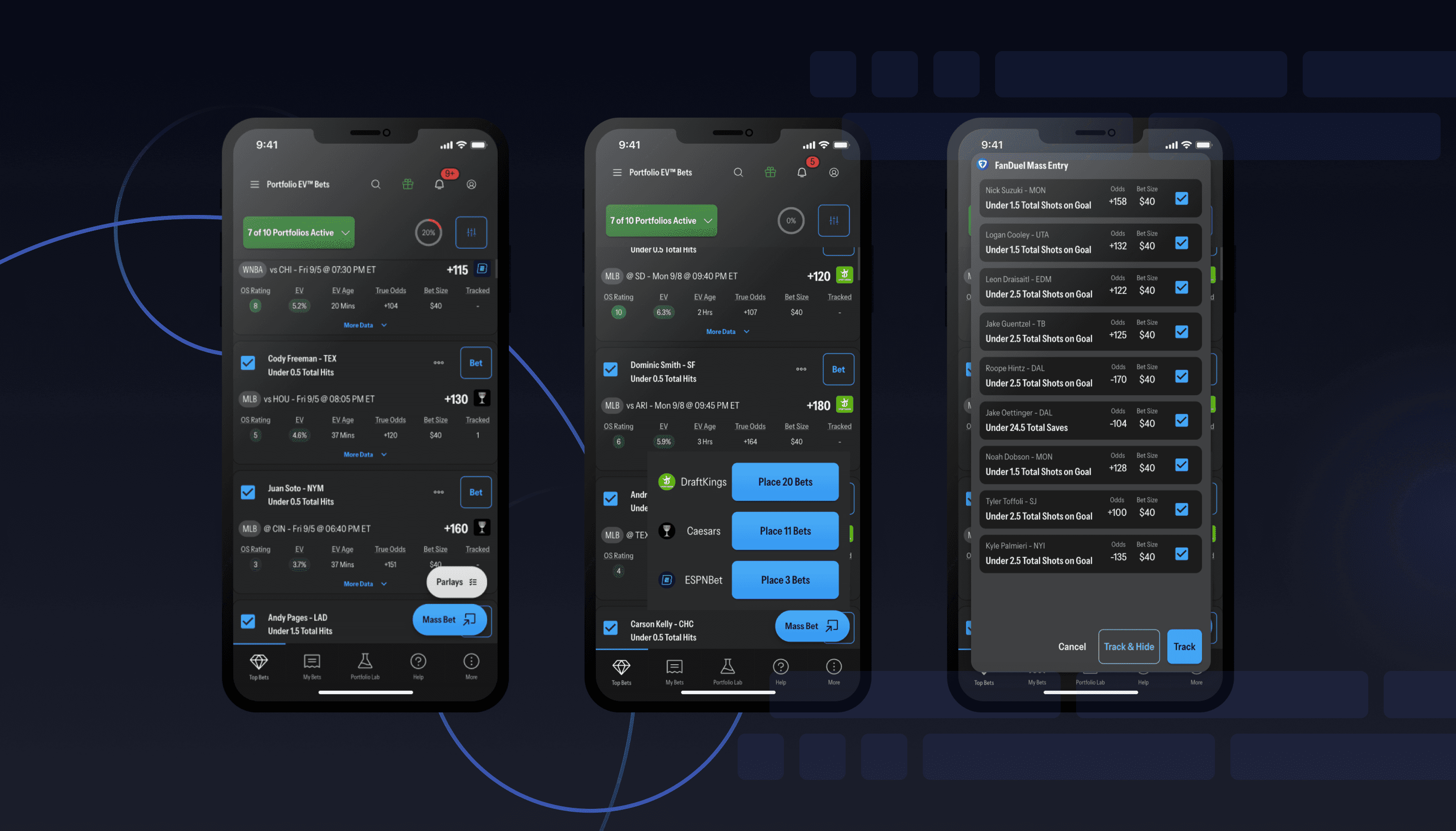
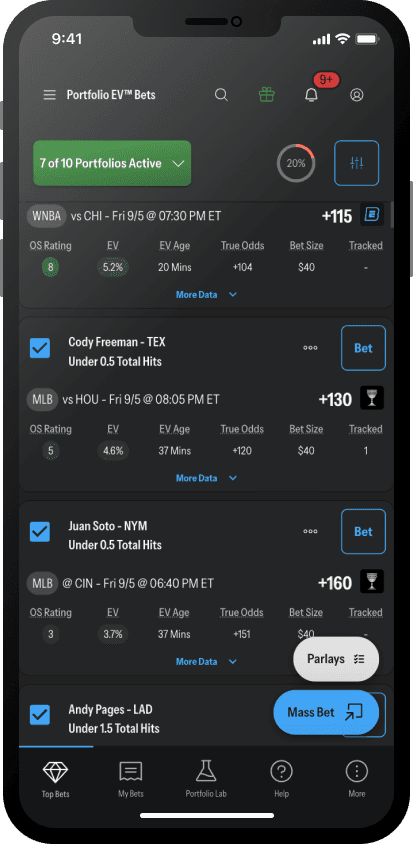
FAB (Floating Action Button)
Primary action located on the primary bet screen for PortfolioEV™. The mobile version is a FAB (floating action button) that maintained valuable real estate but gave users access to the action no matter how far they scrolled into the bet list.
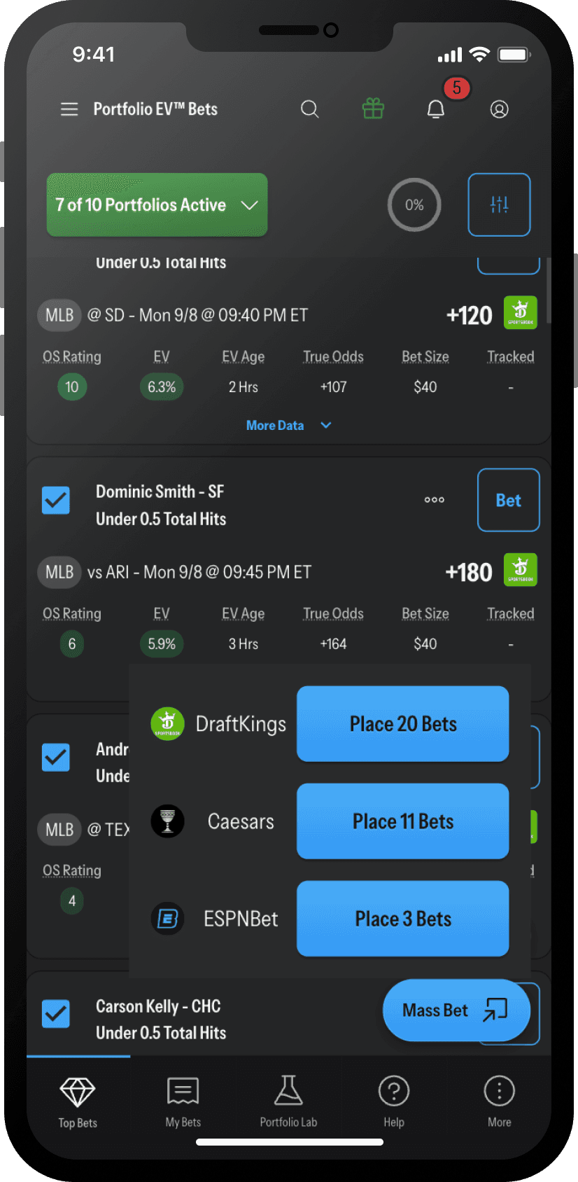
Dynamic Action Modal
Upon pressing the FAB, a small modal appeared giving users a list of sportsbooks they currently had available +EV bets for with an action button that listed how many bets would be sent to the sportsbook.
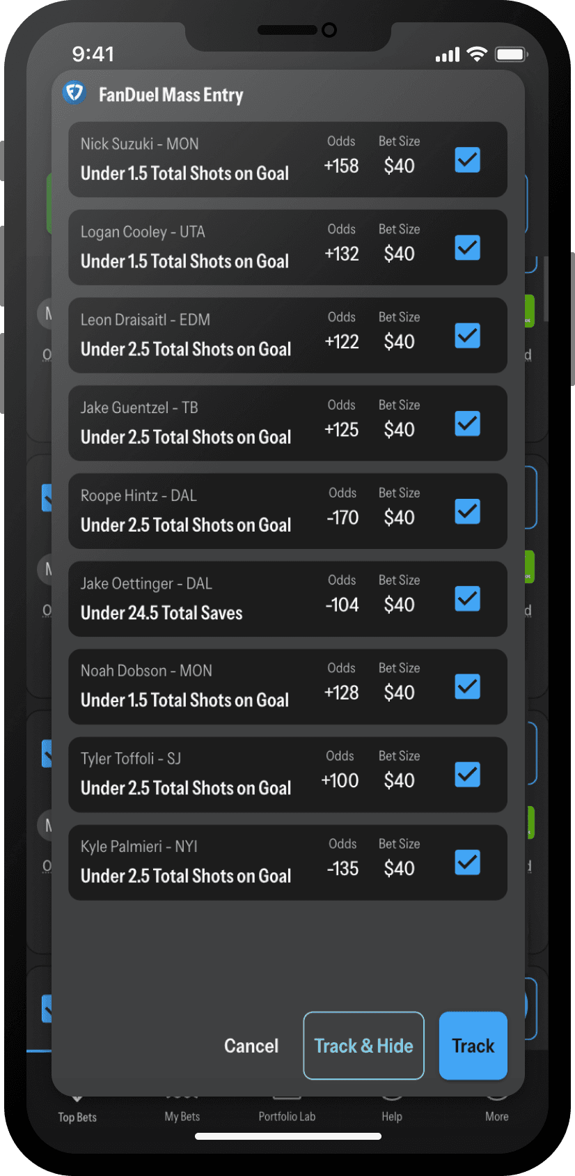
Confirmation & Bet Tracking Prompt
After placing the bets at the sportsbook, the user would come back to a modal containing the bets they just placed. They could then choose to track those bets with or without hiding them from the table, or if something happen to go wrong during the process, they could cancel/close the modal and do it all again in seconds.
Takeaways
It's not often that design solutions have such a profoundly positive impact on a the users of a product. I'm proud of the effort that went in to this solution to solve a major problem among our user base, as well as add to the list of competitive advantages our product holds. No competitor had implemented a feature like this. My main takeaways from this project were:
Think outside of the box - just because something seems farfetched, or outside of the norm, absolutely does not mean it can't turn in to a solution with positive results.
Be smart when choosing test participants - if it weren't for the brand new users I tested the prototype with, it would have taken us much longer to learn that this new feature was not resonating with new users, hurting our retention rates.
Collaborate continuously - the data team and development team deserve credit for this solution as well since they were voices and minds that were able to figure out it was possible with the sportsbooks in the first place. Our collaboration lead to beautiful solution to a user-hindering problem.